

Looks like you're in United States.Switch to the United States site →

FlyKitt - Packaging Redesign for Travel Usability

Improved low-light readability and capsule identification while aligning packaging with updated brand identity.
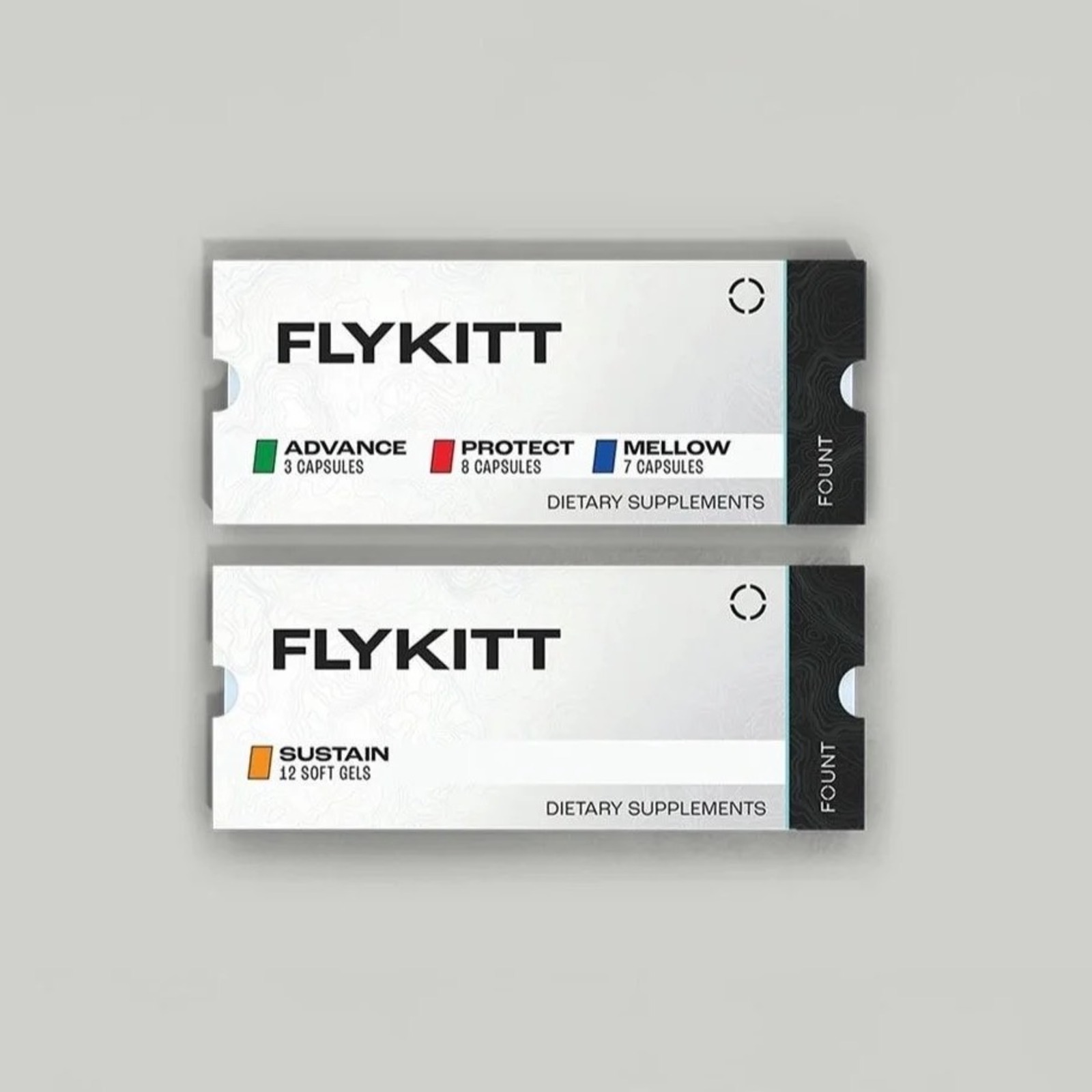
FlyKitt - Packaging Redesign for Travel Usability

Overview

Overview

FlyKitt is a jet lag solution designed for long-haul travel. As part of a broader brand update, I led a packaging redesign focused on improving clarity, legibility, and real-world usability while aligning the product with the new visual direction.


The Challenge

  • Translate updated brand direction into a cohesive packaging system
  • Improve readability in low-light flight environments
  • Enhance capsule identification without increasing visual complexity


Strategic Insight

Travelers often use FlyKitt in dim cabin lighting, where subtle color differences and small labels can become difficult to distinguish. The packaging needed to reflect the updated brand while performing better in real-world travel conditions. The goal was to modernize the system visually while strengthening functional clarity.


Strategic Decisions

  • Applied the updated brand identity to the packaging system
  • Introduced a lighter, higher-contrast color palette optimized for low-light visibility
  • Retained recognizable color cues while adding clearer function-based callouts
  • Refined hierarchy to prioritize clarity and ease of use


Execution

  • Redesigned primary packaging to align with new brand standards
  • Enhanced capsule labeling system for quicker differentiation
  • Prepared production-ready files aligned with compliance requirements


Outcome

  • Improved usability during nighttime travel
  • Successfully aligned packaging with updated brand identity
  • Delivered a clearer, more cohesive system built to scale

The Client

Flykitt
Company
Flykitt
Headquarters
US

About Flykitt

Flykitt is a DTC health tech company that sells an all-in-one system to eliminate jet lag and travel fatigue for frequent travelers. The company combines physical supplement kits with an AI-powered app that creates personalized travel health plans based on individual trips, developed from research with Navy SEALs and fighter pilots.

The Challenge

FlyKitt, a jet lag solution for long-haul travel, needed to translate an updated brand direction into a cohesive packaging system. Travelers often used the product in dim cabin lighting, where subtle color differences and small labels became difficult to distinguish. The packaging required improved readability in low-light flight environments and enhanced capsule identification without increasing visual complexity.

Our Approach

Chameleon Collective led a packaging redesign that applied the updated brand identity to the packaging system and introduced a lighter, higher-contrast color palette optimized for low-light visibility. The team retained recognizable color cues while adding clearer function-based callouts and refined hierarchy to prioritize clarity and ease of use. The redesign enhanced the capsule labeling system for quicker differentiation and prepared production-ready files aligned with compliance requirements.

The Impact

I mproved usability during nighttime travel Successfully aligned packaging with updated brand identity Delivered a clearer, more cohesive system built to scale

Featured Expert

The Chameleon who led this engagement.

← All Case StudiesWork With Us