


 Personal work
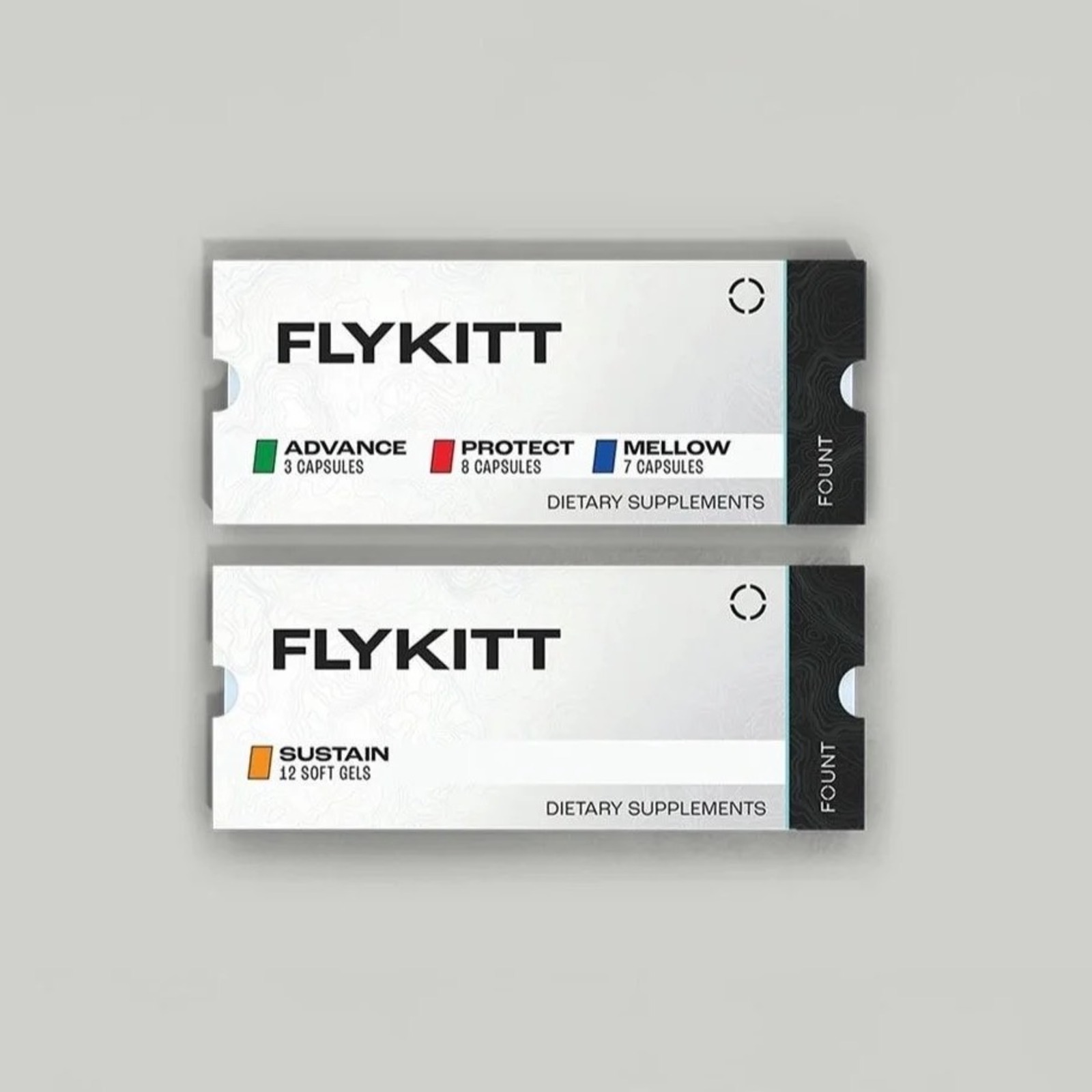
FlyKitt - Packaging Redesign for Travel Usability
OverviewFlyKitt is a jet lag solution designed for long-haul travel. As part of a broader brand update, I led a packaging redesign focused on improving clarity, legibility, and real-world usability while aligning the product with the new visual direction.The ChallengeTranslate updated brand direction into a cohesive packaging systemImprove readability in low-light flight environmentsEnhance capsule identification without increasing visual complexityStrategic InsightTravelers often use FlyKitt in dim cabin lighting, where subtle color differences and small labels can become difficult to distinguish. The packaging needed to reflect the updated brand while performing better in real-world travel conditions. The goal was to modernize the system visually while strengthening functional clarity.Strategic DecisionsApplied the updated brand identity to the packaging systemIntroduced a lighter, higher-contrast color palette optimized for low-light visibilityRetained recognizable color cues while adding clearer function-based calloutsRefined hierarchy to prioritize clarity and ease of useExecutionRedesigned primary packaging to align with new brand standardsEnhanced capsule labeling system for quicker differentiationPrepared production-ready files aligned with compliance requirementsOutcomeImproved usability during nighttime travelSuccessfully aligned packaging with updated brand identityDelivered a clearer, more cohesive system built to scale