Sweet Success: Revolutionizing Licorice with an Iconic Brand Identity & Packaging Design
Challenge:
Serial entrepreneur Warren Struhl envisioned licorice as a premium, gift-worthy product – a far cry from its usual commodity status. However, bringing this vision to life, from a brand perspective, proved challenging. The aim was not only to create a memorable and desirable product but also to encapsulate a brand philosophy that was, as yet, intangible.
Approach:
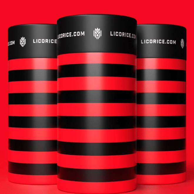
Aligning with Struhl’s vision, veteran brand & packaging designer Matt Cave embarked on a journey to create an impactful visual identity for Licorice.com. The resulting design was an iconic, ownable black and red striped packaging and a striking logo, perfectly capturing what the Struhl family had struggled to express. This fun yet luxurious design set a solid foundation for the Licorice.com brand. Matt’s expertise extended further into art direction, web design for the Shopify site, and an evolution in packaging for gift-giving purposes, leading to the creation of customizable premium gift boxes – just in time for the holiday season.
Impact:
Licorice.com’s reinvention led to sales that exceeded all expectations! The unique and eye-catching black and red licorice tubes grabbed the attention of influential figures, landing a feature on Oprah’s Valentine’s Day O List in Oprah’s O Magazine. In a testament to the strong brand identity, Licorice.com vending machines echoing the black & red theme are now in production, further amplifying the brand’s reach and recognition. This demonstrates how the powerful combination of a visionary entrepreneur and strategic branding can revolutionize even the most traditional products.


