Discover our top picks for full-spectrum email marketing, from ideation to analytics.
More than 4.3 billion people use email. That alone bodes well for any email marketing strategy. No other platform can compare to those figures, not even Facebook. According to Statista data, more than 306.4 billion emails were sent each day in 2020. Of those, top email tools like Mailchimp, Campaign Monitor, and GetResponse put the average open rate at anywhere from 17.8% to 22.5%, with an average of $42 ROI for every $1 spent.
The numbers paint an impressive picture, but that’s also why many marketers balk at email: it’s a crowded stage.
Still, there’s plenty of room for brands and companies to succeed. If you want to be among them, it’s best first to empower your strategy with the right tools. Use these top five email marketing tools to stand out in the inbox.
For Ideation & Inspiration: Really Good Emails
Sometimes, a simple glance at someone else’s email will make you say, “That’s it!” From there, you can take that design and run with it in your direction. Tailor it to your audience, change the colors to match your brand, and take the guesswork out of designing professional, branded emails.
If you need a lot of visual content inspiration beyond your inbox, look no further than Really Good Emails. They live up to their name by curating the best of the best email marketing examples from all around the world. Their collection features over 8,720 different emails that you can draw inspiration from, both from a design and coding perspective.
Sign up for an account and bookmark your favorite emails. Search by category or email type to find emails that are relevant to what you want to send. At the very least, sign up for their email newsletter (the one you’ll actually want to receive!) that will send you the best email examples they collect each week.
For Email Template Testing: Email on Acid
When email marketers create what they think to be the email to end all emails, they press the Send button, send it good vibes, and hope for the best. They don’t notice that they’ve left a line of Lorem Ipsum in the preview text or didn’t change the text on the call to action button—until they’ve sent the email to their entire subscriber list.
It happens even to best-in-class brands. Take HBO, for instance. Their intern recently sent a blank test email to thousands of people. The company owned up to it, the internet population made a joke about it, and everyone was actually very understanding. And let’s not forget all that free publicity.
Your customers might be just as understanding if something like this were to happen to you. But if you’d rather avoid any major “Oops!” moments and missed opportunities to wow your subscribers, then you should look into Email on Acid.
Their easy workflows integrate with your email checklists and processes to ensure an error-free email before you hit Send. They’ve taken a deep dive into the nuts and bolts that many marketers overlook, reminding you to check everything from UTM validation to ADA compliance. There’s no coding involved, and the platform is packed with click-to-fix tools that take the headache out of polishing up your emails.
You can also resolve any deliverability issues with your emails before you send them. The platform helps you check your email against 23 Spam filters and popular blocklist servers so that you aren’t spending money on emails that will never be delivered. You can also test other elements like subject lines and see how your email will appear across devices and various email clients.
Email on Acid offers a free trial so you can look at its features up close and personal, learn how they work, and see how it helps you create the perfect email with ease.
For A/B Testing: Statistical Significance Calculator
A/B testing is a must for any email marketer. Small tweaks can influence the overall effectiveness of your campaign. Maybe it’s a single word in your subject line. Or maybe you want to test completely different email templates. Campaign Monitor did exactly this and saw a 127% increase in click-throughs. You never really know what people will respond to, which is the whole point of A/B testing in the first place.
But don’t obsess too much over changing an emoji or a greeting just yet. Even if you see that one version of an email performed better than another, how do you know if your tests are statistically significant? What impact did that small change really have on your sales?
On the surface, a better open rate for one email might look like “the one,” but the email with fewer opens might actually have better conversions. Maybe the call to action is more compelling, or maybe something else appeals to the audience once they’re read your message.
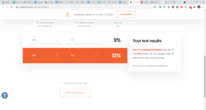
One easy way to tell with confidence which campaign was actually better is to use a Statistical Significance Calculator, like this one from A/B Test Guide. It compares your visitors from each campaign to the conversion rate to figure out which one is better: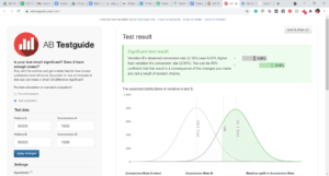
Neil Patel offers a similar calculator to show you whether an A/B test is statistically significant. It doesn’t have a graph, but its clean interface gives you just the information you really need to know.
You should know with confidence how much your A/B testing matters in terms of conversions. But more importantly, you should also understand why statistical significance matters and how to use these calculations to make a real difference in your email marketing. Open rates mean little if your emails can’t convert.
For Email Coding: Uplers
If you want more of a personalized, made-from-scratch look and feel to your emails, you’re going to need some coding. If that’s not in your wheelhouse, check out Uplers to find some of the best coding talent in the world, on demand.
This platform for outsourced UI and UX serves as an extension of your in-house marketing team. Every candidate has been fully vetted and tested to save you time and hassle. Once you’re ready to hire, just log into the platform, find quality talent, and start your email coding project.
What’s more, they can handle all aspects of email design, including building a template that you can reuse again and again.
For Benchmarking: Campaign Monitor, Mailchimp, & Benchmark Email
What happens after you send the email is just as important as everything that brought you to that point. After you design the perfect email, it’s time to track its performance—not just against your data but also your industry’s standards.
We suggest always comparing your emails to at least two benchmarking reports. You deserve to know if others in your industry are seeing much higher open rates and conversions than you. Likewise, it’s also cool to know just how much better you’re doing compared to competitors.
Start with Campaign Monitor’s Benchmark Report, which has analyzed more than 100 billion emails sent globally. They’ve compiled benchmark data like open rates, clicks, and unsubscribes for all industries as a whole, as well as specific verticals like advertising, professional services, agriculture, healthcare, and nonprofits, among many others.
Mailchimp offers another great email benchmark report by industry. Data is taken from companies that range from 1-person startups to Fortune 500 companies for a more apples-to-apples comparison.
Last but not least, check out Benchmark’s Email Marketing benchmark report to see how your email marketing stacks up against others.
If you’re brand new to email marketing, keep in mind your benchmarks might not measure up to others in your industry, and that’s okay. As you experiment more with what works and doesn’t work for your brand, you should see growth over time—proof you’re heading in the right direction.
Ready to grow your business with email marketing? Contact us today to learn how.
