Check out this guide for actionable tips you can implement today.
There’s no denying that competition is fierce in the e-commerce market, and Amazon’s marketplace is no exception.
Did you know that 70% of shoppers on Amazon never move past the first page of search results? In fact, according to recent statistics, 35% of users tend to make a move for the first product featured on a search page.
Even more interesting is the fact that 64% of clicks are going towards just the first three products on Amazon’s search page.
With these statistics in mind, it’s easy to understand why every little detail counts when it comes to the performance of your Amazon listing.
Images are perhaps one of the most effective forms of content in a posting. Image quality is a factor that can truly make or break your success.
If you’re interested in learning the best methods for improving your Amazon images for the purpose of boosting your listing and increasing conversions, then look no further than these next few lines.
Amazon Image Requirements
The first step to ensuring your images are of top-notch quality is confirming they adhere to Amazon’s image guidelines.
Technical requirements surrounding images include following a standard format of TIFF, JPEG, GIF, or PNG. Amazon also suggests dimensions of at least 1,000 pixels or larger in either height or width. Plus, it accepts CMYK or sRGB color modes.
The platform also has specific requirements regarding naming your image files. In order for your image to adhere to guidelines, it must include the item’s product identifier (ASIN, UPC, ISBN, AEN, or JAN). Then follow it with a period and the appropriate file extension (i.e., “.jpg”, “.tiff”, “.gif”, “.png”).
Furthermore, if you include any spaces, dashes, or additional characters in the file name, the image will be prevented from going online.
The site also enforces numerous guidelines for product images.
Site standards for product images are those which the Amazon platform require for consistency and aesthetics. For one, the main cover image must be a photograph that accurately represents the product being sold. The image must also be professionally lit, in focus, not contain any “gratuitous or confusing” additional objects, and have “realistic color” and “smooth edges.”
The full product must be in the frame and backgrounds must be pure white. And the image is not allowed to contain any additional “text, graphics, or insert images.”
Furthermore, any product should take up at least 85% or more of the image frame. If you’re planning on selling any books, videos, or music, the main image must be the cover art and fill 100% of the image frame.
Any casing, cellophane, or promotional stickers are banned, and any offensive or pornographic image is not allowed.
Additional images must adhere to the same basic standards. The main differences are that cropped and close-up images are acceptable, as are varied backgrounds, text, and “demonstrative graphics”.
5 Tips for Better Images

Scale
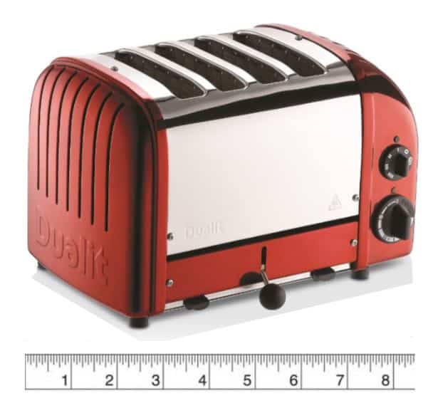
It’s easy for customers to be mislead when it comes to product sizing. This is not necessarily the seller or photographer’s fault. But it is your duty to ensure that the customer gets the most accurate representation of the product as possible.
As a result, including measuring units for reference is highly advised. This is also much better than including other objects as a reference (i.e. a coin) because it eradicates all ambiguity on the customer’s end.

Image Priority
One important factor to remember is to assign priority to the various images you upload in your listing. It’s important because requirements vary from main product images to additional images. Amazon’s platform gives you the ability to place your images in a specific order, which is a great opportunity to enhance the customer experience and present the images in the most logical manner.
For example, if you’re selling handbags, it makes sense to set the front of the handbag as the main image. Then, proceed with a back and side view, followed by an inside view and detail picture.
Composition and Background

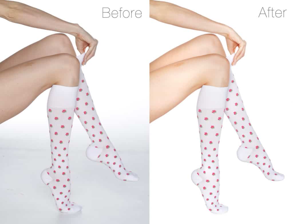
We’ve already touched on the fact that Amazon favors white backgrounds, especially for the main image. Another tactic you can utilize to enhance your images is to use what is called an infinity curve. This is sometimes also referred to as an infinity cove. An infinity curve/cove is when a photographer erases any indication of a background in a product image – leaving only plain, white space.
Ensuring your image is properly composed and utilizing the effect of an infinity curve/cove can give your images an added aesthetic and professional boost over your competition.
Variety
As you can imagine, it’s vital to add a variety of images to your Amazon product listings. But it’s not enough to use just two or three. Amazon’s platform gives you a certain allotment of images to incorporate into your listing, and it’s important to make use of all of them. Get as many angles as possible to remove any inkling of doubt that may arise in the customer’s mind.
Product videos are also highly recommendable. They allow the consumer to see the product in action and give you a unique opportunity to sell your product in a way that static images cannot.
Amazon also recently launched 360 Spin, enabling sellers to use images that show a 360-degree view of the product. The results have been interesting, with the average listing that utilized this feature showing a 6-8% increase in conversions.

Optimization
It’s important that your images focus on optimization. Especially the main image as it’s the first one to show up in the Amazon search results. Making sure your main image is high-quality, contains nothing more than the product it’s selling, and is free of clutter is an excellent way to catch the consumer’s eye as they go through the results page.
If possible, try to highlight any unique product features in the image. Is it extendable? Show the product extending. Is it flexible? Demonstrate this by manipulating it. These are all clever ways you can optimize your main image and ensure it draws attention to your product.
Final Thoughts
There’s no denying that your images can make or break you when it comes to how your Amazon listings perform. Ensuring that your posting complies with Amazon’s guidelines as well as taking advantage of the various features and options available to you are crucial tactics for guaranteeing your listing’s success.
With so much competition in Amazon’s marketplace, there’s no excuse for failing to exhaust every possible opportunity essential to your listing’s success. So, what are you waiting for? Start on implementing these awesome tactics and give your listing that extra boost over the competition it deserves today.
Sources:
https://sellerengine.com/improve-amazon-listings-7-tips-product-images
https://clippingpathindia.com/blogs/tips/4-important-tips-optimizing-amazon-product-images
https://sellics.com/blog-complete-guide-product-image-optimization-amazon
https://www.amazon.com/gp/help/customer/display.html?nodeId=200109520


