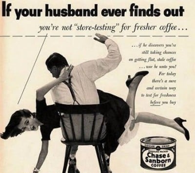
We recently compiled lists of the best and worst ads from 2012. It’s instructive to see just how much better modern advertising is compared to “modern” advertising from 40 years ago.
So we flipped through the pages of “The Male Mystique,” a book about vintage men’s advertising by Jacques Boyreau, and picked out the worst ads from men’s magazines in the 1960s and 1970s.
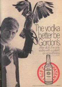
Some of the brands, like Gordon’s gin and Lee jeans, ran ads that would be regarded as parodies today. Others, like the defunct Broomsticks pants company, appear to have doomed the brands they were trying to promote by tying them too closely to the fads of the time.
You can tell that companies were trying to play off whatever random pop culture events are trendy no matter how irrelevant it is to the brand.
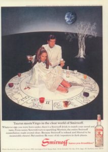
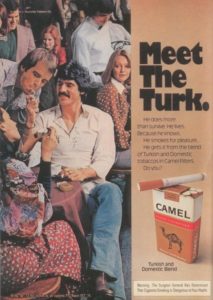
Following the 1967 law requiring cigarette companies to warn consumers about the harmful effects of smoking, this 1975 ad features a surgeon general’s warning.
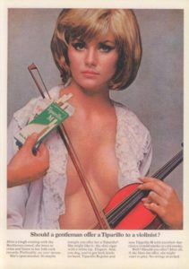
Tiparillo had an extremely odd view of the effect of cigarettes on female musicians.
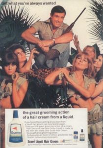
This 1967 ad looks like it may have provided inspiration for current Axe advertisements.
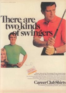
We’ll stick to golf thanks.
This was how Gordon’s saw itself in 1969.
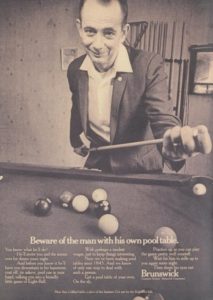
This 1969 ad has fine text that reads “More than a billiard table, a piece of fine furniture. Get one for the (heh, heh) kids.”
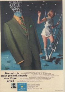
The space obsession of the ’60s and ’70s permeated advertisements during this period as well.
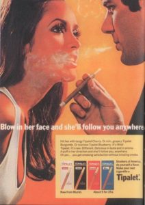
Tipalet’s tagline makes this perhaps the company’s most well-known ad.
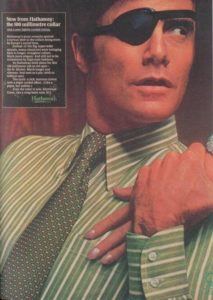
David Ogilvy’s ‘Man in the Hathaway Shirt,’ with his trademark eye patch, was regarded as the height of adventurous sophistication at the time.
This ad was racist and made a rape joke at the same time.
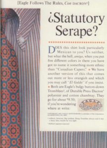
Note the text at the bottom of the ad for “design your own” beach jeans.
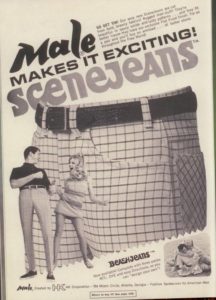
Botany 500 suits were worn by many leading TV stars, including Dick Van Dyke and Sherman Hemsley on ‘The Jeffersons.’
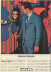
Somehow, the Big Brute brand never survived.
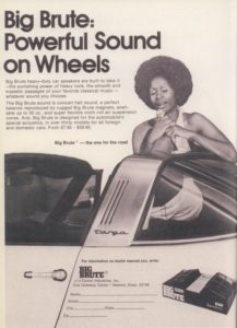
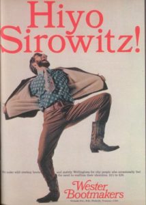
This appears to be some sort of Lone Ranger/Jewish joke.
This kind of thing happened all the time in the 1960s.
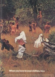
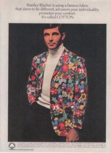
Sport coat maker Stanley Blacker is still in business today despite this ad.
