Regal Springs – Crafting a New Identity: The Evolution of Regal Springs through Premium Branding and Packaging Design
Challenge:
Regal Springs, the dominating player in the premium Tilapia market, found itself at a crossroads. Despite having a 90% market share, 98% of their business came from private labels, and their branded products lacked visibility and appeal in grocery stores. The company’s current identity and packaging did not stand out, and failed to communicate their key competitive advantages.
Approach:
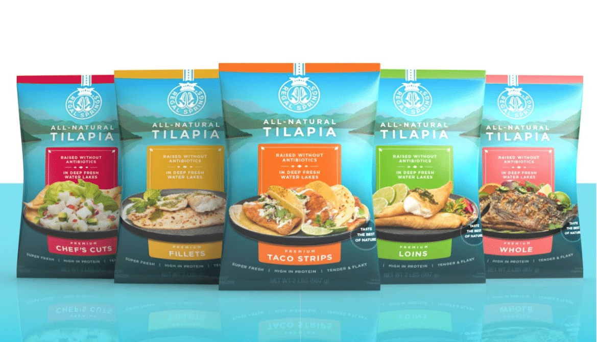
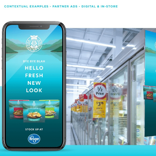
The Chameleon Team undertook a comprehensive revamp of Regal Springs’ brand. We crafted a modern visual identity and an enticing packaging design for the entire product line, while constructing a compelling brand narrative for spreading the word. With a clear presentation hierarchy for key competitive claims, our design system aimed to boost future product expansion, enhance shopability, elevate brand visibility, and improve profit margins.
Impact:
Through this premium branded design system, Regal Springs successfully repositioned its brand identity, boosting consumer recognition and appeal. The modernized packaging and advertising design effectively communicates the brand’s unique selling points, driving increased consumer engagement and purchase intent.